# Data manipulation
library(data.table)
library(recipes)

# Data visualization
library(ggplot2)
theme_set(theme_light())

# Model creation
library(h2o)
library(cluster)
library(tidymodels)
library(tidyclust)

# Extracting model information
library(broom)
library(factoextra)
library(dendextend)
library(NbClust)9 Unsupervised Learning
It refers to a set of statistical tools intended for the setting in which we have only a set of features \(X_1,X_2, \dots ,X_p\) measured on \(n\) observations is to discover interesting things about the measurements like:
- Finding an informative way to visualize and explore the data
- Imputing missing values
- Discovering subgroups among the variables or among the observations
As result, the exercise tends to be more subjective.
9.1 Libraries to use
9.2 Principal Components Analysis (PCA)
9.2.1 Purpose
As the number of variables increases checking two-dimensional scatterplots gets less insightful since they each contain just a small fraction of the total information present in the data set.
For example, if we see correlations between features is easy to create more general categories known as latent variable as follow:
- Sandwich
- cheese - mayonnaise
- mayonnaise - bread
- bread - cheese
- bread - lettuce
- Soda
- pepsi - coke
- 7up - coke
- Vegetables
- spinach - broccoli
- peas - potatoes
- peas - carrots
At the end this process can help to:
- Reduce the number of featured need to describe the data
- Remove multicollinearity between features
9.2.2 Mathematical Description
PCA finds a low-dimensional representation of a data set that contains as much variation (information) as possible. It assumes that all dimensions can be described as a linear combination of the \(p\) original variables, known as principal component scores.
\[ Z_1 = \phi_{11} X_1 + \phi_{21} X_2 + \dots + \phi_{p1} X_p \]
Where:
- \(\phi_1 = (\phi_{11} \phi_{21} \dots \phi_{p1})^T\) represent the loading vector for the first principal component.
- \(\sum_{j=1}^p \phi_{j1}^2 = 1\)
9.2.3 Steps to apply
To perform a principal components analysis (PCA) need to:
Make any needed transformation to tidy the data.
Remove or impute any missing value.
Transform or variables to be numeric by using method like one-hot encoding.
Center and scale all the variables in \(\mathbf{X}\) to have mean zero and standard deviation one. This step is important to ensure all variables are on the same scale, particularly if they were measured in different units or have outliers. To have a visual representation of the importance of this step less try to calculate how different are two people based on their height and weight.
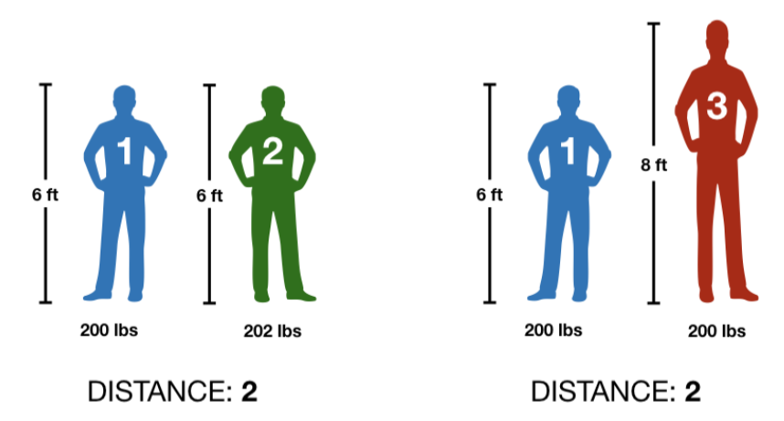
In both cases we got the same distance and that doesn’t make sense, so let’s standardize the values with the next function.
\[ \text{height}_\text{scaled} = \frac{\text{height} - mean(\text{height})}{sd(\text{height})} \]
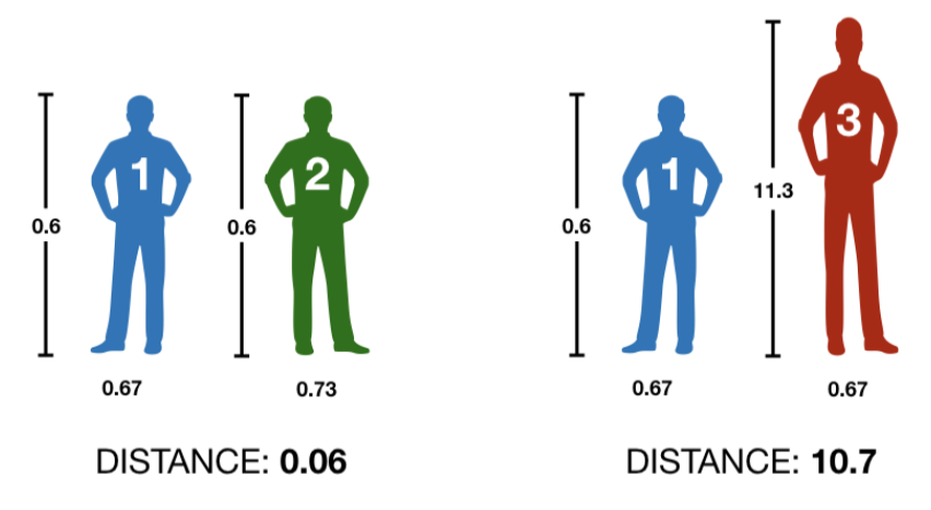
Returning a more intuive result.
- The loading vector is determined by solving the following optimization problem using eigen decomposition. This identifies the direction with the largest variance in the feature space and reveals the relative contributions of the original features to the new PCs.
\[ \underset{\phi_{11}, \dots, \phi_{p1}}{\text{maximize}} \left\{ \frac{1}{n} \sum_{i = 1}^n \left( \sum_{j=1}^p \phi_{j1} x_j \right)^2 \right\} \text{ subject to } \sum_{j=1}^p \phi_{j1}^2 = 1 . \]
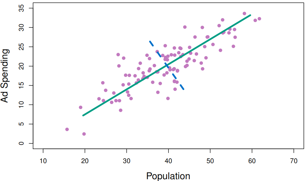
- Repeat the process until having \(\min(n-1, p)\) distinct principal components. Each new component must be orthogonal to all previously computed principal components to ensure that each new component captures a new direction of variance assuring a new uncorrelated new component.
9.2.4 R implementation
- Getting the data
my_basket <- fread("https://koalaverse.github.io/homlr/data/my_basket.csv")- Apply the PCA function
stats_pca <- prcomp(
  # Numeric data.frame o matrix
  my_basket,

  # Set standard deviation to 1 before applying PCA
  # this is really useful when sd is very different between columns
  # but we don't nee
  scale = TRUE,

  # Set mean to 0 before applying PCA
  # it's better to keep it TRUE
  center = TRUE
)
After performing a PCA we can see the next elements:
names(stats_pca)[1] "sdev" "rotation" "center" "scale" "x" -
center:the column means used to center to the data, or FALSE if the data weren’t centered. -
scale: the column standard deviations used to scale the data, or FALSE if the data weren’t scaled. -
rotation: the directions of the principal component vectors in terms of the original features/variables. This information allows you to define new data in terms of the original principal components. -
x: the value of each observation in the original dataset projected to the principal components.
Java is a prerequisite for H2O.
# turn off progress bars for brevity
h2o.no_progress()

# connect to H2O instance with 5 gigabytes
h2o.init(max_mem_size = "5g")
H2O is not running yet, starting it now...

Note:  In case of errors look at the following log files:
    C:\Users\angel\AppData\Local\Temp\RtmpK2LxY3\filea1546bdd714f/h2o_angel_started_from_r.out
    C:\Users\angel\AppData\Local\Temp\RtmpK2LxY3\filea1543e103410/h2o_angel_started_from_r.err


Starting H2O JVM and connecting:  Connection successful!

R is connected to the H2O cluster:
    H2O cluster uptime:         6 seconds 643 milliseconds
    H2O cluster timezone:       America/La_Paz
    H2O data parsing timezone:  UTC
    H2O cluster version:        3.42.0.2
    H2O cluster version age:    3 months and 12 days
    H2O cluster name:           H2O_started_from_R_angel_zko681
    H2O cluster total nodes:    1
    H2O cluster total memory:   4.43 GB
    H2O cluster total cores:    8
    H2O cluster allowed cores:  8
    H2O cluster healthy:        TRUE
    H2O Connection ip:          localhost
    H2O Connection port:        54321
    H2O Connection proxy:       NA
    H2O Internal Security:      FALSE
    R Version:                  R version 4.2.3 (2023-03-15 ucrt)
# convert data to h2o object
my_basket.h2o <- as.h2o(my_basket)-
pca_method: When your data contains mostly numeric data use “GramSVD”, but if the data contain many categorical variables (or just a few categorical variables with high cardinality) we recommend to use “GLRM”. -
k: Integer specifying how many PCs to compute.Usencol(data). -
transform: Character string specifying how (if at all) your data should be standardized. -
impute_missing: Logical specifying whether or not to impute missing values with the corresponding column mean. -
max_runtime_secs: Number specifying the max run time (in seconds) to limit the runtime for model training.
h2o_pca <- h2o.prcomp(
  training_frame = my_basket.h2o,
  pca_method = "GramSVD",
  k = ncol(my_basket.h2o),
  transform = "STANDARDIZE",
  impute_missing = TRUE,
  max_runtime_secs = 1000
)

h2o.shutdown(prompt = FALSE)
pca_rec <- recipe(~., data = my_basket) |>
step_normalize(all_numeric()) |>
step_pca(all_numeric(), id = "pca") |>
prep()9.2.5 Extract the variance explained by each component
h2o_pca@model$importance |>
  t() |>
  as.data.table(keep.rownames = "component") |>
  head(5L)
component Standard deviation Proportion of Variance Cumulative Proportion
1: pc1 1.513919 0.05457025 0.05457025
2: pc2 1.473768 0.05171412 0.10628436
3: pc3 1.459114 0.05069078 0.15697514
4: pc4 1.440635 0.04941497 0.20639012
5: pc5 1.435279 0.04904821 0.25543833tidy(pca_rec,
id = "pca",
type = "variance") |>
filter(component <= 5) |>
pivot_wider(id_cols = component,
names_from = terms,
values_from = value)# A tibble: 5 × 5
component variance `cumulative variance` `percent variance`
<int> <dbl> <dbl> <dbl>
1 1 2.29 2.29 5.46
2 2 2.17 4.46 5.17
3 3 2.13 6.59 5.07
4 4 2.08 8.67 4.94
5 5 2.06 10.7 4.90
# ℹ 1 more variable: `cumulative percent variance` <dbl>9.2.6 Select the components to explore
Variance criterion
As the sum of the variance (eigenvalues) of all the components is equal to the number of variables entered into the PCA.
stats_pca_variance[, .(total_variance = sum(std.dev^2))] total_variance
1: 42A variance of 1 means that the principal component would explain about one variable’s worth of the variability. In that sense we would just be interesting in selecting components with variance 1 or greater.
stats_pca_variance[std.dev >= 1] PC std.dev percent cumulative
1: 1 1.513919 0.05457 0.05457
2: 2 1.473768 0.05171 0.10628
3: 3 1.459114 0.05069 0.15698
4: 4 1.440635 0.04941 0.20639
5: 5 1.435279 0.04905 0.25544
6: 6 1.411544 0.04744 0.30288
7: 7 1.253307 0.03740 0.34028
8: 8 1.026387 0.02508 0.36536
9: 9 1.010238 0.02430 0.38966
10: 10 1.007253 0.02416 0.41382Scree plot criterion
The scree plot criterion looks for the “elbow” in the curve and selects all components just before the line flattens out, which looks like 8 in our example.
stats_pca_variance |>
  ggplot(aes(PC, percent, group = 1, label = PC)) +
  geom_point() +
  geom_line() +
  geom_text(nudge_y = -.002,
            check_overlap = TRUE)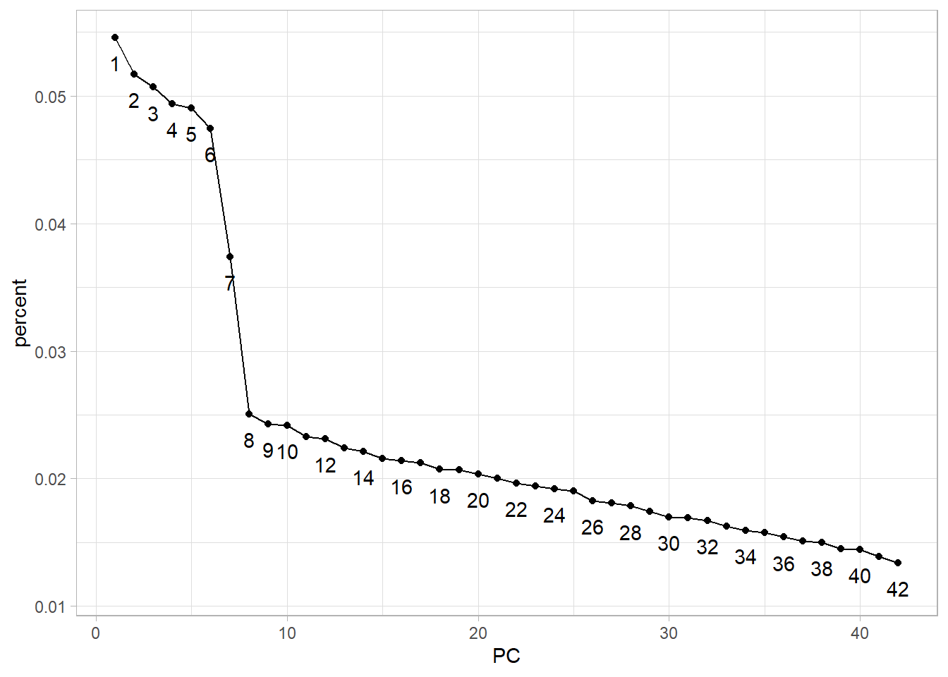
fviz_eig(stats_pca,
         geom = "line",
         ncp = 30,
         ggtheme = theme_light())+
  geom_text(aes(label = dim),
            nudge_y = -.2,
            check_overlap = TRUE)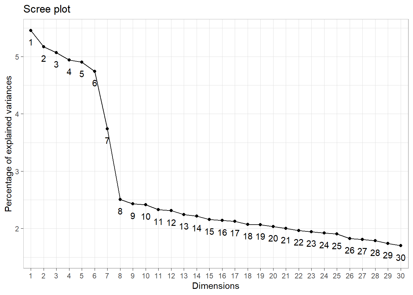
Proportion of variance explained criterion
Depending of the use case the investigator might want to explain a particular proportion of variability. For example, to explain at least 75% of total variability we need to select the first 27 components.
stats_pca_variance[cumulative >= 0.75][1L] PC std.dev percent cumulative
1: 27 0.8718093 0.0181 0.76444Conclusion
The frank answer is that there is no one best method for determining how many components to use. If we were merely trying to profile customers we would probably use 8 or 10, if we were performing dimension reduction to feed into a downstream predictive model we would likely retain 26 or more based on cross-validation.
9.2.7 Interpret the results
- PC1 can be interpreted as the Unhealthy Lifestyle component, as the higher weights are associated with less healthy behaviors, such as alcohol (bulmers, red.wine, fosters, kronenbourg), sweets (mars, twix, kitkat), tobacco (cigarettes), and potentially gambling (lottery).
stats_pca_loadings <-
  tidy(stats_pca, matrix = "loadings")

setDT(stats_pca_loadings)

stats_pca_loadings[PC == 1
  ][order(-value)
  ][, rbind(.SD[1:10],
            .SD[(.N-9L):.N])] |>
  ggplot(aes(value, reorder(column, value))) +
  geom_point()+
  geom_vline(xintercept = 0,
             linetype = 2,
             linewidth = 1)+
  labs(y = "Original Columns",
       x = "Unhealthy / Entertainment Lifestyle")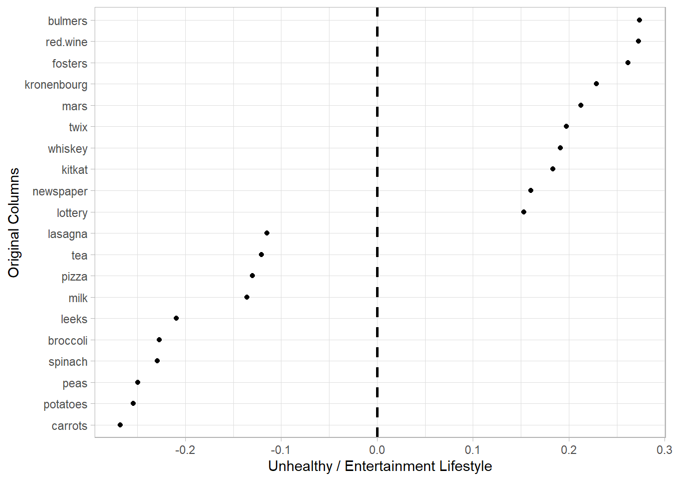
fviz_contrib(stats_pca,
             choice = "var",
             axes = 1,
             sort.val = "asc",
             top = 25)+
  coord_flip()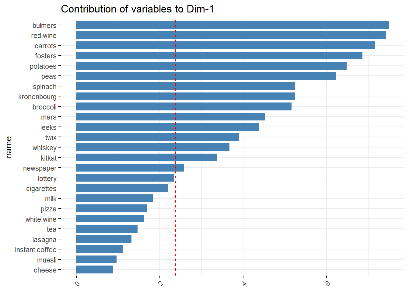
- PC2 can be interpreted as the a Dine-in Food Choices component, as associated items are typically part of a main meal that one might consume for lunch or dinner.
stats_pca_loadings[PC == 2
  ][order(-value)
  ][, rbind(.SD[1:10],
            .SD[(.N-9L):.N])] |>
  ggplot(aes(value, reorder(column, value))) +
  geom_point()+
  geom_vline(xintercept = 0,
             linetype = 2,
             linewidth = 1)+
  labs(y = "Original Columns",
       x = "Dine-in Food Choices")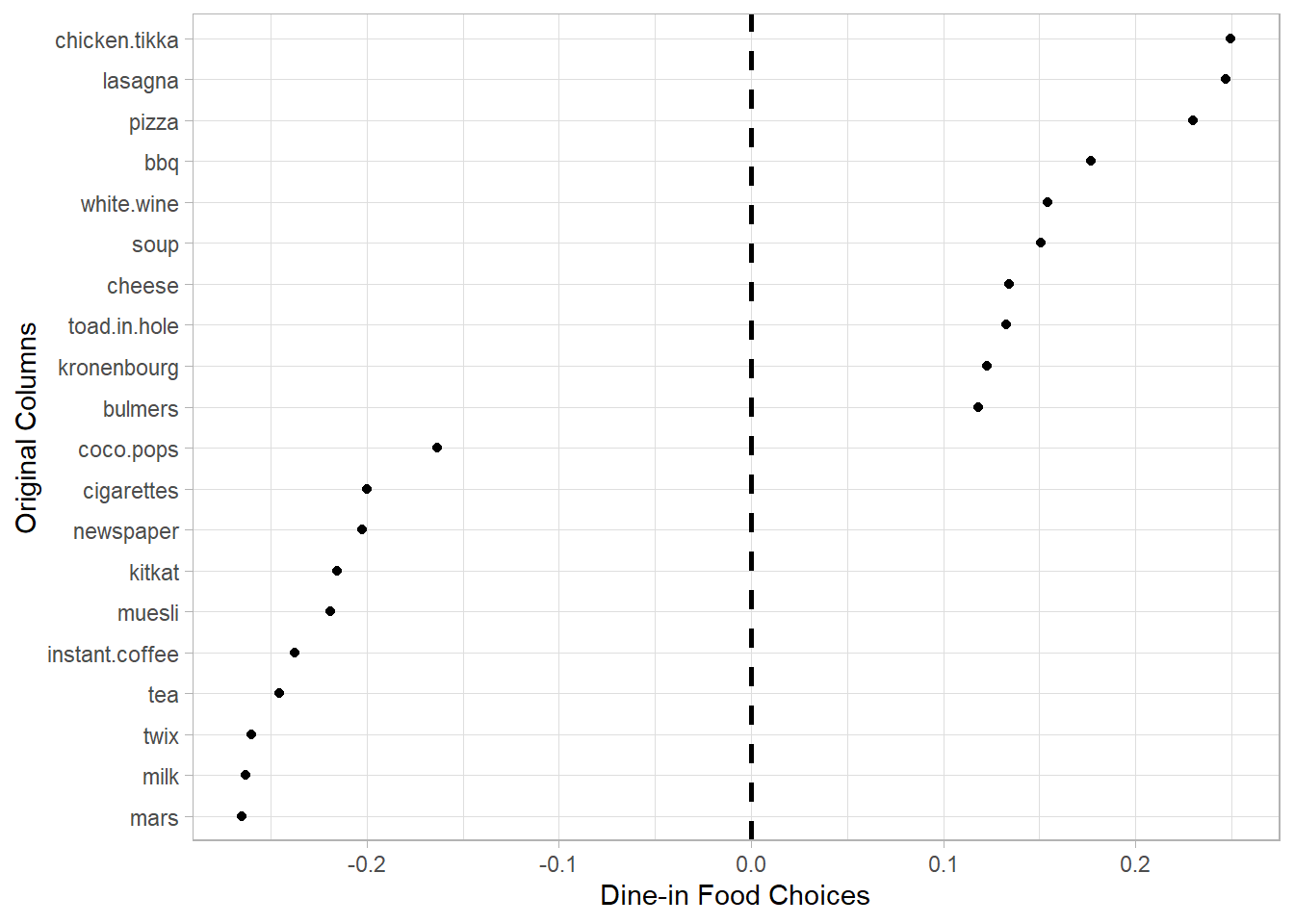
fviz_contrib(stats_pca,
             choice = "var",
             axes = 2,
             sort.val = "asc",
             top = 25)+
  coord_flip()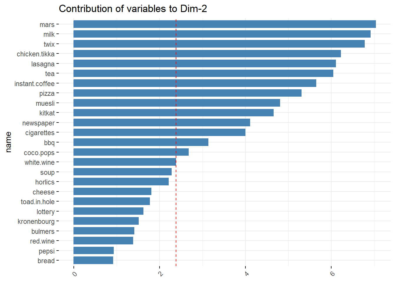
- Find correlated features. As this can be hard we have many features let’s use the
irisdata set.
iris_pca <- prcomp(iris[-5])iris_pca$rotation |>
as.data.table(keep.rownames = "column") |>
ggplot(aes(`PC1`, `PC2`, label = column)) +
geom_vline(xintercept = 0,
linetype = 2,
linewidth = 0.3)+
geom_hline(yintercept = 0,
linetype = 2,
linewidth = 0.3)+
geom_text()+
geom_segment(aes(xend = `PC1`,
yend = `PC2`),
x = 0,
y = 0,
arrow = arrow(length = unit(0.15, "inches")))+
labs(title = "Component Loadings",
x = "PC 1",
y = "PC 2")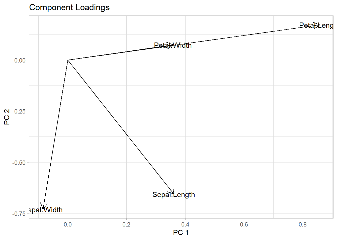
fviz_pca_var(iris_pca,
             check_overlap = TRUE)+
  labs(title = "Component Loadings",
       x = "PC 1",
       y = "PC 2")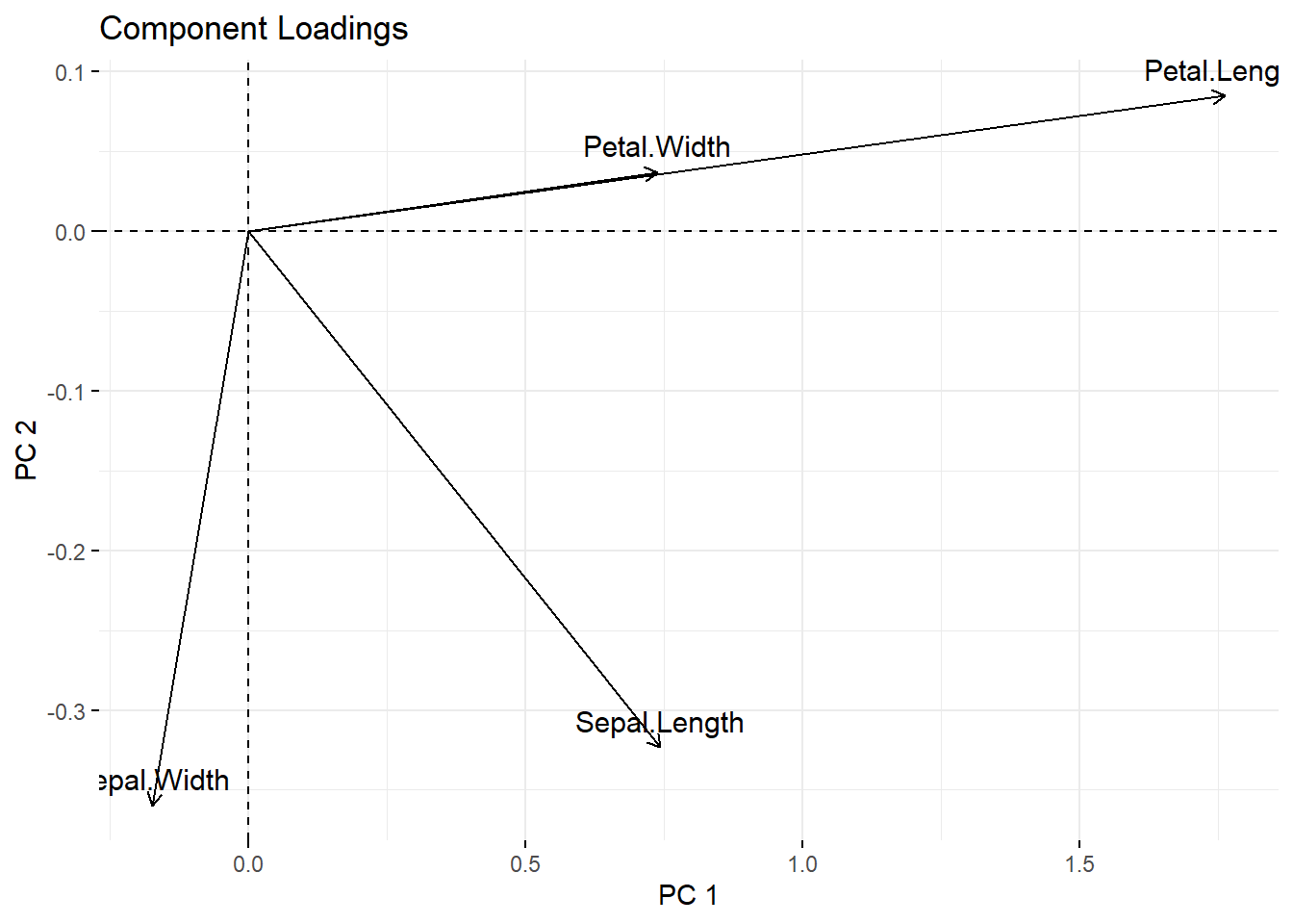
- Found out how much each feature contribute to new components.
stats_pca_loadings[PC <= 2L
  ][, contrib := sqrt(sum(value^2)),
    by = "column"] |>
  dcast(column + contrib ~ PC,
        value.var = "value") |>
  ggplot(aes(`1`, `2`, label = column)) +
  geom_text(aes(alpha = contrib),
            color = "navyblue",
            check_overlap = TRUE)+
  geom_vline(xintercept = 0,
             linetype = 2,
             linewidth = 0.3)+
  geom_hline(yintercept = 0,
             linetype = 2,
             linewidth = 0.3)+
  labs(title = "Component Loadings",
       x = paste0("Unhealthy Lifestyle (",
                  scales::percent(stats_pca_variance$percent[1L],
                                  accuracy = 0.01),")"),
       y = paste0("Dine-in Food Choices (",
                  scales::percent(stats_pca_variance$percent[2L],
                                  accuracy = 0.01),")"))+
  theme(legend.position = "none")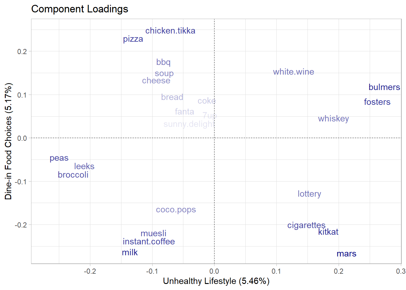
fviz_pca_var(stats_pca,
             geom = "text",
             col.var = "contrib",
             check_overlap = TRUE)+
  scale_color_gradient(low = NA, high = "navyblue")+
  coord_cartesian(xlim = c(-0.5,0.5),
                  ylim = c(-0.5,0.5))+
  theme(legend.position = "none")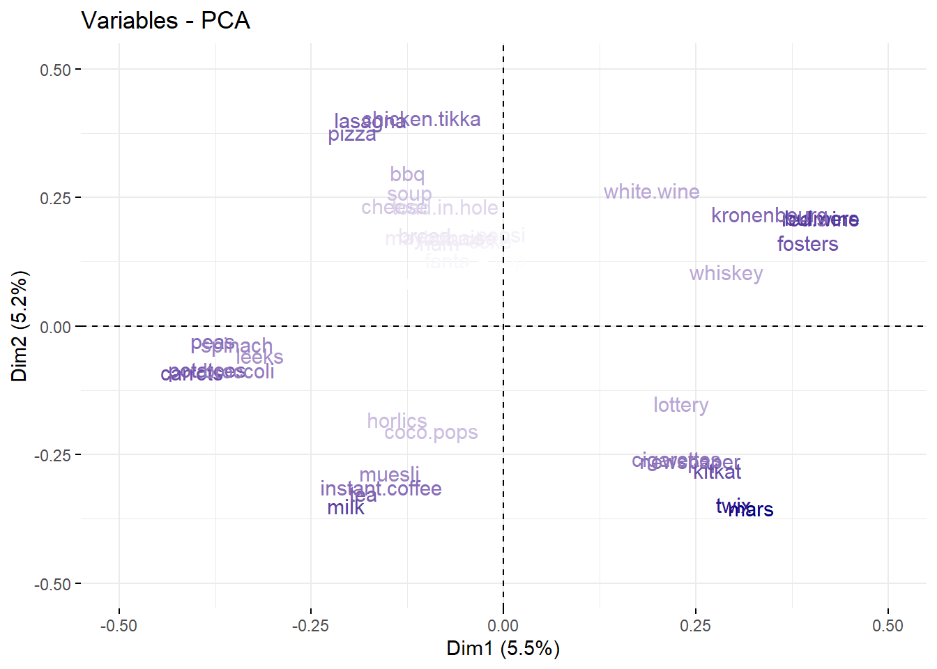
9.3 Clustering
It refers to a very broad set of techniques for finding subgroups, or clusters, in a data set. Some applications could be to:
- Find few different unknown subtypes of breast cancer.
- Perform market segmentation by identify subgroups of people who might be more likely to purchase a particular product.
9.3.1 K-means clustering
In K-means clustering, we seek to partition the observations into a pre-specified number of non-overlapping clusters \(K\).
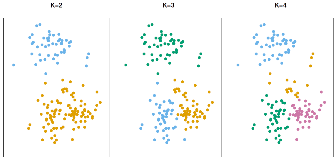
For this method, the main goal is to classify observations within clusters with high intra-class similarity (low within-cluster variation), but with low inter-class similarity.
Mathematical Description
Let \(C_1, \dots, C_K\) denote sets containing the indices of the observations in each cluster, where:
Each observation belongs to at least one of the \(K\) clusters. \(C_1 \cup C_2 \cup \dots \cup C_K = \{1, \dots,n\}\)
No observation belongs to more than one cluster. \(C_k \cap C_{k'} = \emptyset\) for all \(k \neq k'\).
\[ \underset{C_1. \dots, C_K}{\text{minimize}} = \left\{ \sum_{k=1}^k W(C_k) \right\} \]
\(W(C_k)\) represent the amount by which the observations within a cluster differ from each other. There are many possible ways to define this concept, but the most common choice involves squared euclidean distance, which is sensitive to outliers and works better with gaussian distributed features.
\[ W(C_k) = \frac{1}{| C_k|} \sum_{i,i' \in C_k} \sum_{j=1}^p (x_{ij} - x_{i'j})^2 \] Where:
- \(|C_k|\): Denotes the number of observations in the \(k\)th cluster
Distance alternatives
Some alternatives to the euclidean distance more robust to outliers and Non-normal distributions are:
- Manhattan distance
- Minkowski distance
- Gower distance
If we want to calculate the similarity for binary variables or categorical variables after applying one-hot encoding, we can use the Jaccard Index to calculate the distance.
\[ \begin{split} J(A,B) & = \frac{\overbrace{A \cap B}^\text{elements common to A and B}}{\underbrace{A \cup B}_\text{all elements in A and B}} \\ \text{Distance} & = 1 - J(A,B) \end{split} \]
We can find the distance related to the Jaccard Index by typing the next function in R.
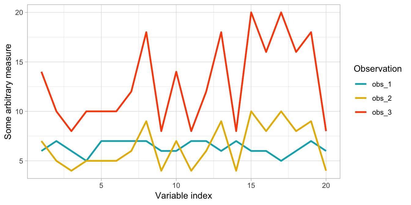
dist(x, method = "binary")If you are analyzing unscaled data where observations may have large differences in magnitude but similar behavior then a correlation-based distance is preferred like:
- \(1 - \text{Pearson correlation}\)
- \(1 - \text{Spearman correlation}\)
- \(1 - \text{Kendall Tau correlation}\)
Aproximation algorithm
As solving this problem would be very difficult, since there are almost \(K^n\) ways to partition n observations into \(K\) clusters, but we can use a very simple algorithm to find local optimum.
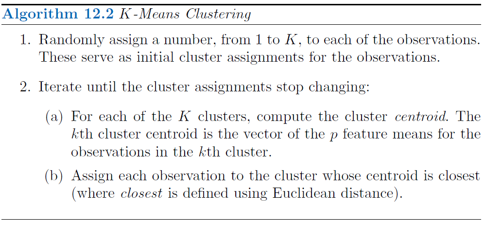
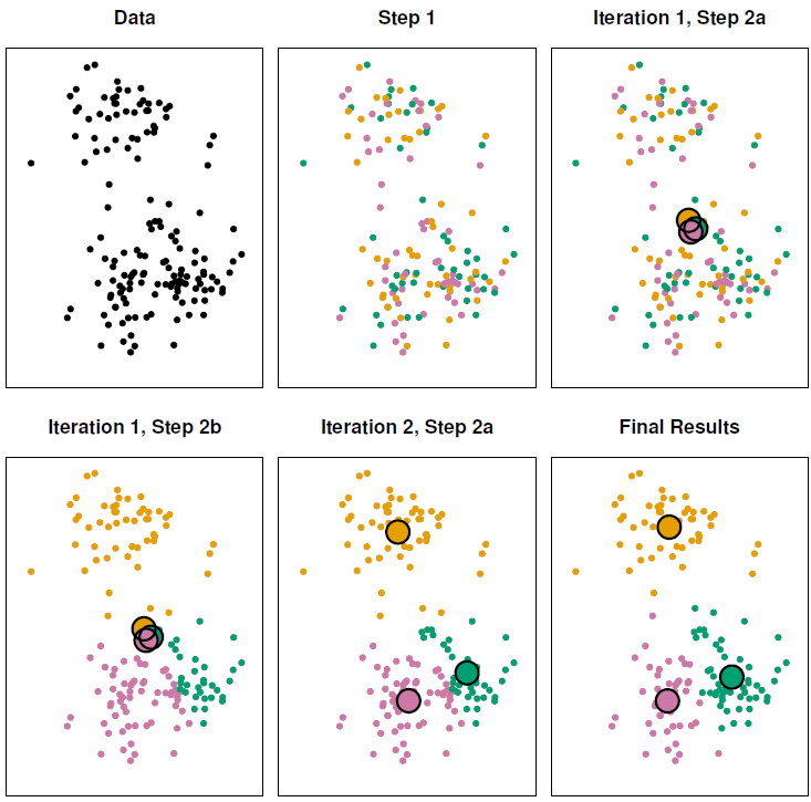
Since the results obtained will depend on the initial (random) cluster assignment of each observation it is important to run the algorithm multiple times (10-20) from different random initial configurations (random starts). Then one selects the solution with the smallest objective.
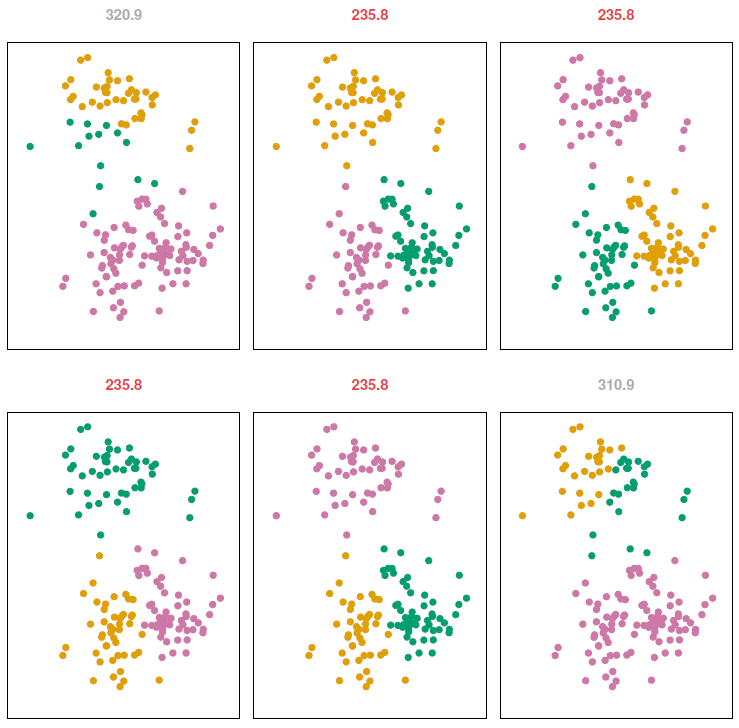
To validate that we are modeling signal rather than noise the algorithm should produce similar clusters in each iteration.
Coding example
To perform k-means clustering on mixed data we need to:
- Convert any ordinal categorical variables to numeric
- Convert nominal categorical variables to one-hot encode
- Scale all variables
ames_scale <- AmesHousing::make_ames() |>
  # select numeric columns
  select_if(is.numeric) |>

  # remove target column
  select(-Sale_Price) |>

  # coerce to double type
  mutate_all(as.double) |>

  # center & scale the resulting columns
scale() - Compute the distances between the rows of a data matrix
# Dissimilarity matrix
ames_dist <- dist(
  ames_scale,
  method = "euclidean"
)- Perform k-means clustering after setting a seed
- Measure model’s quality (Total within-cluster sum of squares). Which represent the sum all squared distances from each observation to its cluster center in the model.
ames_kmeans$tot.withinss |> comma()[1] "7,099,192"9.3.2 Hierarchical clustering
- It doesn’t require to define the number of clusters.
- It returns an attractive tree-based representation (dendrogram).
It assumes that clusters are nested, but that isn’t true k-means clustering coud yield better.
Understanding dendrograms
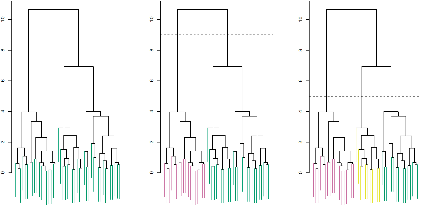
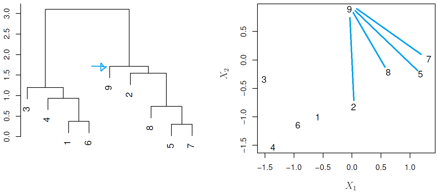
In general we can say that:
- Each leaf represent an observation
- Similar the groups of observations are lower in the tree
- Different the groups of observations are near the top of the tree
- The height of the cut controls the number of clusters obtained.
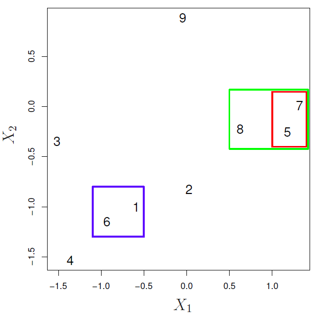
In the next example:
- {1,6} and {5,7} are close observations
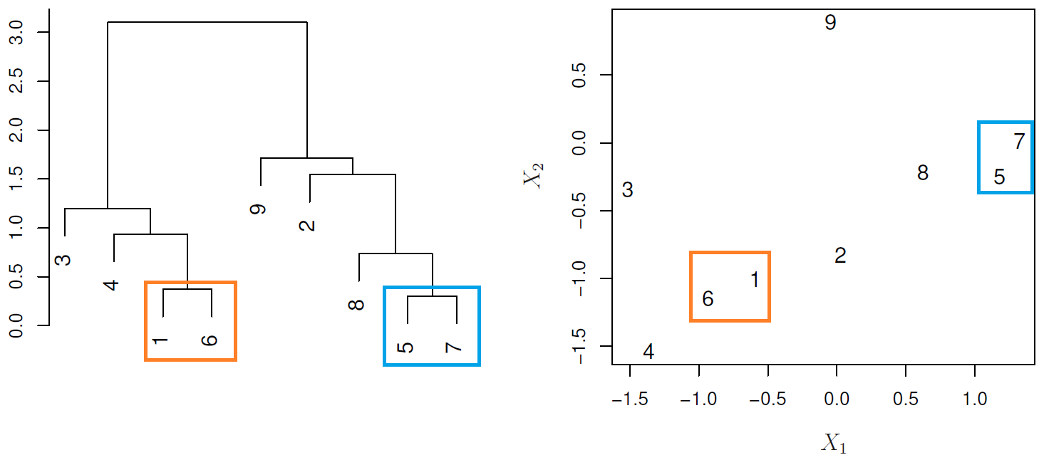
- Observation 9 is no more similar to observation 2 than it is to observations 8, 5, and 7, as it was fused at higher height of the cut.
Hierarchical Clustering Types
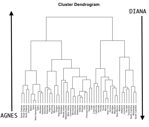
Agglomerative Clustering (AGNES, Bottom-up)
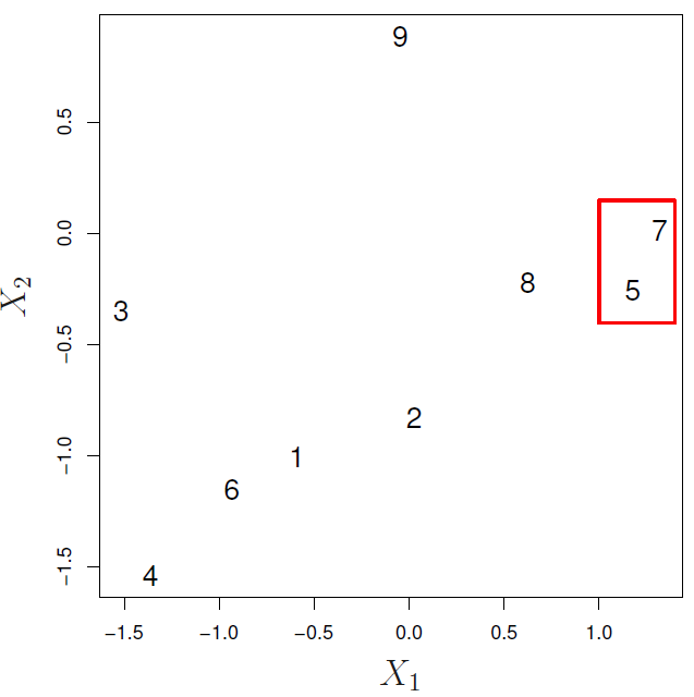
- Defining a dissimilarity measure between each pair of observations, like Euclidean distance and correlation-based distance.
- Defining each of the \(n\) observations as a cluster.
- Fusing the most similar 2 clusters and repeating the process until all the observations belong to one single cluster.
- Step 1
- Step 2
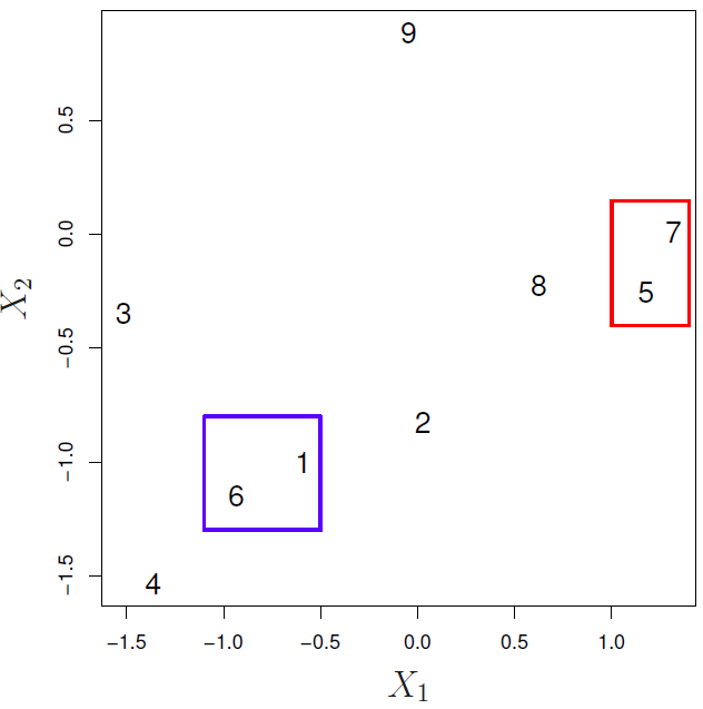
- Step 3
It is good at identifying small clusters.
Divisive Clustering (DIANA, top-down)
- Defining a dissimilarity measure between each pair of observations, like Euclidean distance and correlation-based distance.
- Defining the root, in which all observations are included in a single cluster.
- The current cluster is split into two clusters that are considered most heterogeneous. The process is iterated until all observations are in their own cluster.
It is good at identifying large clusters.
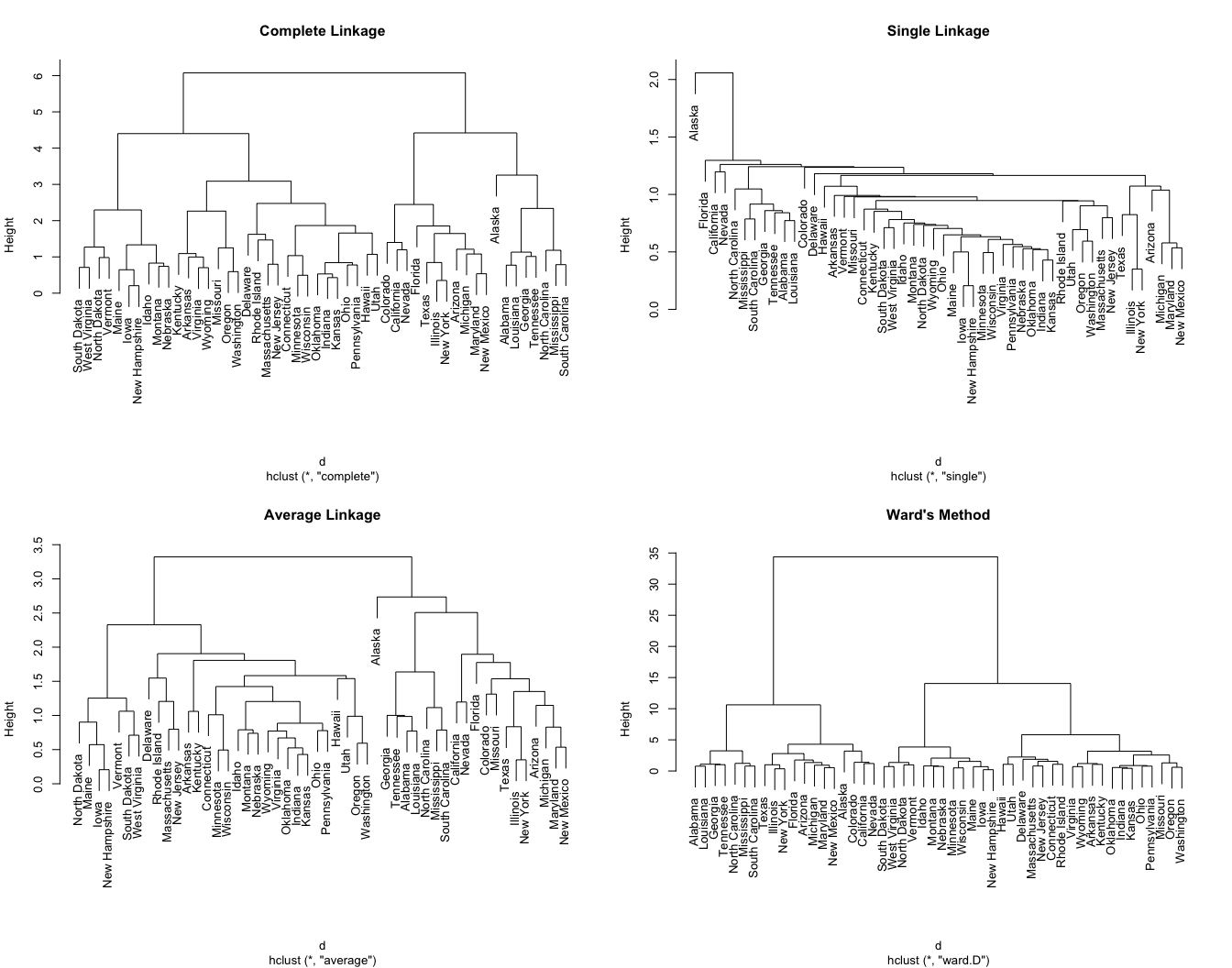
Linkage
It measures the dissimilarity between two clusters and defines if we will have a balanced tree where each cluster is assigned to an even number of observations, or an unbalanced tree to find outliers.
-
AGNES clustering
- Complete (maximal intercluster dissimilarity): Record the largest dissimilarity between cluster \(A\) and \(B\). It tends to produce more compact clusters and balanced trees.
- Ward’s minimum variance: Minimizes the total within-cluster variance. At each step the pair of clusters with the smallest between-cluster distance are merged. Tends to produce more compact clusters.
-
DIANA clustering
- Average (mean intercluster dissimilarity): Record the average dissimilarity between cluster \(A\) and \(B\). It can vary in the compactness of the clusters it creates, but must of the time produces balanced trees.
Single (minimal intercluster dissimilarity): Record the smallest dissimilarity between cluster \(A\) and \(B\). It tends to produce more extended clusters and unbalanced trees.
Centroid: Computes the dissimilarity between the centroid for cluster \(A\) (a mean vector of length \(p\), one element for each variable) and the centroid for cluster \(B\). It is often used in genomics, but inversions can lead to difficulties in visualizing and interpreting of the dendrogram.
Coding example
Once we have our distance matrix we just need to define a linkage method. The default is the complete one.
ames_hclust <- hclust(
  ames_dist,
  method = "ward.D"
)
Defining linkage method
To define the best method we can use the coef.hclust function from the cluster package to extract the agglomeration coefficients from the result of a hierarchical cluster analysis, which indicate the cost of merging different clusters at each stage of the clustering process. As result, the higher this value is, the more dissimilar the clusters being merged are.
cluster_methods <- c(
  "average",
  "single",
  "complete",
  "ward.D"
)

setattr(cluster_methods,
        "names",
        cluster_methods)

sapply(cluster_methods,
       \(x) fastcluster::hclust(ames_dist, method = x) |>
        coef.hclust() ) |>
  sort(decreasing = TRUE)
ward.D complete average single
0.9972137 0.9267750 0.9139303 0.8712890 As we were expecting the the best result was using the “ward.D” linkage as the default R hclust performs a bottom-up algorithm.
Plotting Dendrogram
This dendrogram takes too much to be plotted.
as.dendrogram(ames_hclust) |>
  color_branches(h = 800) |>
plot()fviz_dend(ames_hclust, k = 2)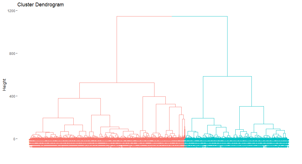
Getting clusters
To get the clusters we have 2 alternatives:
- Defining the number of clusters to export.
cutree(ames_hclust, k = 2) |> table() |> prop.table()
        1         2
0.3959044 0.6040956 - Defining the height where the tree should be cut, which returns groups where the members of the created clusters have an euclidean distance amongst each other no greater than our cut height if where are using the complete linkage.
cutree(ames_hclust, h = 400) |> table() |> prop.table()
        1         2         3         4
0.1853242 0.1795222 0.2105802 0.4245734
9.3.3 Partitioning around medians (PAM)
It has the same algorithmic steps as k-means but uses the median rather than the mean to determine the centroid; making it more robust to outliers.
As your data becomes more sparse the performance of k-means and hierarchical clustering become slow and ineffective. An alternative is to use the Gower distance, which applies a particular distance calculation that works well for each data type.
- quantitative (interval): range-normalized Manhattan distance.
- ordinal: variable is first ranked, then Manhattan distance is used with a special adjustment for ties.
-
nominal: variables with \(k\) categories are first converted into \(k\) binary columns (i.e., one-hot encoded) and then the Dice coefficient is used. To compute the dice metric for two observations \((X,Y)\) the algorithm looks across all one-hot encoded categorical variables and scores them as:
- a — number of dummies 1 for both observations
- b — number of dummies 1 for \(X\) and 0 for \(Y\)
- c - number of dummies 0 for \(X\) and 1 for \(Y\)
- d — number of dummies 0 for both and then uses the following formula:
\[ D = \frac{2a}{2a + b +c} \]
# Original data minus Sale_Price
ames_full <-
  AmesHousing::make_ames() |>
  subset(select = -Sale_Price)

# Compute Gower distance for original data
gower_dst <- daisy(ames_full, metric = "gower")

# You can supply the Gower distance matrix to several clustering algos
pam_gower <- pam(x = gower_dst, k = 8, diss = TRUE)
9.3.4 Clustering large applications (CLARA)
It uses the same algorithmic process as PAM; however, instead of finding the medoids for the entire data set it considers a small sample size and applies k-means or PAM.
clara(my_basket, k = 10)Call: clara(x = my_basket, k = 10)
Medoids:
7up lasagna pepsi yop red.wine cheese bbq bulmers mayonnaise horlics
[1,] 0 0 0 0 0 1 0 0 0 0
[2,] 0 0 0 0 0 0 0 0 0 0
[3,] 0 0 0 0 0 0 0 0 0 0
[4,] 0 0 1 0 0 0 0 0 0 0
[5,] 0 0 1 0 0 0 0 0 0 0
[6,] 0 1 0 0 0 0 0 0 0 0
[7,] 0 0 0 0 0 0 0 1 0 0
[8,] 0 1 0 0 0 0 0 0 0 0
[9,] 0 0 1 0 0 1 0 0 1 0
[10,] 0 1 0 0 0 2 1 1 2 0
chicken.tikka milk mars coke lottery bread pizza sunny.delight ham
[1,] 0 0 0 0 0 2 0 0 0
[2,] 0 0 0 0 0 0 0 0 0
[3,] 0 0 0 0 0 0 0 0 0
[4,] 0 0 0 1 0 0 0 0 0
[5,] 0 0 0 1 0 0 0 1 0
[6,] 0 0 0 0 0 0 1 0 0
[7,] 1 2 0 0 0 0 2 0 0
[8,] 0 0 2 0 0 1 0 0 0
[9,] 0 0 0 0 0 0 2 0 0
[10,] 2 0 0 0 0 0 2 0 0
lettuce kronenbourg leeks fanta tea whiskey peas newspaper muesli
[1,] 0 0 0 0 0 0 0 0 0
[2,] 0 0 0 0 1 0 0 0 0
[3,] 0 0 0 0 0 0 0 0 0
[4,] 0 0 0 0 0 0 0 0 0
[5,] 0 0 0 0 0 0 0 0 0
[6,] 0 0 0 0 0 0 0 0 0
[7,] 0 0 0 0 1 1 0 0 3
[8,] 1 0 0 0 0 0 3 0 0
[9,] 1 0 0 2 0 0 2 0 0
[10,] 1 2 0 0 0 0 0 0 0
white.wine carrots spinach pate instant.coffee twix potatoes fosters soup
[1,] 0 0 0 0 0 0 0 0 0
[2,] 0 0 0 0 0 0 0 0 0
[3,] 0 0 0 0 0 2 0 0 0
[4,] 0 0 0 0 0 0 0 0 0
[5,] 0 0 0 0 0 0 3 0 0
[6,] 0 0 0 0 0 0 0 0 0
[7,] 0 0 0 0 0 0 2 0 0
[8,] 0 0 0 0 0 0 0 0 2
[9,] 0 0 1 0 0 0 5 0 0
[10,] 0 3 1 0 0 0 0 1 0
toad.in.hole coco.pops kitkat broccoli cigarettes
[1,] 0 0 0 0 0
[2,] 0 0 0 0 0
[3,] 0 0 2 0 1
[4,] 0 0 0 0 0
[5,] 0 0 0 0 0
[6,] 0 0 0 0 0
[7,] 1 0 0 1 0
[8,] 0 0 0 0 1
[9,] 0 0 0 0 0
[10,] 0 0 0 1 0
Objective function: 2.702859
Clustering vector: int [1:2000] 1 2 2 3 2 4 5 2 6 2 6 2 2 6 6 4 4 5 ...
Cluster sizes: 227 683 131 418 92 438 5 4 1 1
Best sample:
[1] 14 61 81 113 125 149 255 267 297 300 338 350 357 418 441
[16] 611 628 677 683 704 706 723 724 802 852 854 874 908 994 1038
[31] 1056 1082 1086 1153 1184 1194 1211 1276 1278 1331 1346 1393 1442 1446 1474
[46] 1480 1496 1515 1534 1641 1685 1687 1721 1728 1781 1789 1819 1857 1860 1903
Available components:
[1] "sample" "medoids" "i.med" "clustering" "objective"
[6] "clusinfo" "diss" "call" "silinfo" "data" 9.3.5 Selecting number of clusters
As \(k\) increases the homogeneity between observations in each cluster, but it also increases the risk to overfit the model, but it is important to know that there is not a definitive answer to this question. Some possibilities are:
Defining \(k\) based on domain knowledge or resources limitations. For example, you want to divide customers in 4 groups as you only 4 employees to execute the plan.
-
Optimizing a criterion
- The elbow method tries to minimize the total intra-cluster variation (within-cluster sum of square, WSS) by selecting the number of clusters so that adding another cluster doesn’t improve much better the total WSS.
https://www.datanovia.com/en/lessons/determining-the-optimal-number-of-clusters-3-must-know-methods/
fviz_nbclust(ames_scale,
             FUNcluster = hcut,
             method = "wss",
             hc_method = "ward.D") +
  labs(subtitle = "Elbow method")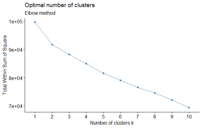
fviz_nbclust(ames_scale,
             FUNcluster = kmeans,
             method = "wss") +
  labs(subtitle = "Elbow method")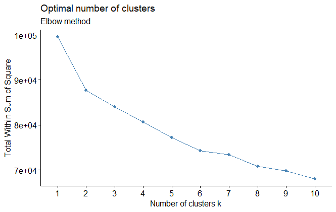
- The silhouette method allows you to calculate how similar each observations is with the cluster it is assigned relative to other clusters.. The optimal number of clusters \(k\) is the one that maximize the average silhouette over a range of possible values for \(k\).
- Values close to 1 suggest that the observation is well matched to the assigned cluster.
- Values close to 0 suggest that the observation is borderline matched between two clusters.
- Values close to -1 suggest that the observations may be assigned to the wrong cluster
fviz_nbclust(ames_scale,
             FUNcluster = hcut,
             method = "silhouette",
             hc_method = "ward.D") +
  labs(subtitle = "Silhouette method")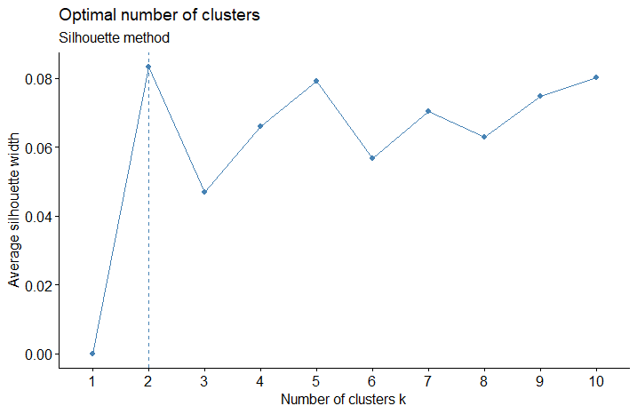
fviz_nbclust(ames_scale,
             FUNcluster = kmeans,
             method = "silhouette") +
  labs(subtitle = "Silhouette method")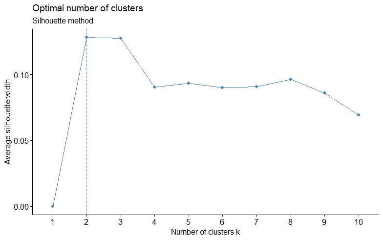
- Gap statistic: Compares the total within intra-cluster variation for different values of \(k\) with their expected values under null reference distribution of the data. The estimate of the optimal clusters will be value that maximize the gap statistic, so the clustering structure would be far away from the random uniform distribution of points.
\[ \text{Gap}(k) = \frac{1}{B} \sum_{b=1}^B \log(W^*_{kb}) - \log(W_k) \]
set.seed(123)
fviz_nbclust(ames_scale,
             FUNcluster = hcut,
             method = "gap_stat",
             hc_method = "ward.D",
             nboot = 50,
             verbose = FALSE) +
  labs(subtitle = "Gap statistic method")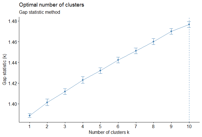
set.seed(123)
fviz_nbclust(ames_scale,
             FUNcluster = kmeans,
             method = "gap_stat",
             nboot = 50,
             nstart = 25,
             verbose = FALSE)+
  labs(subtitle = "Gap statistic method")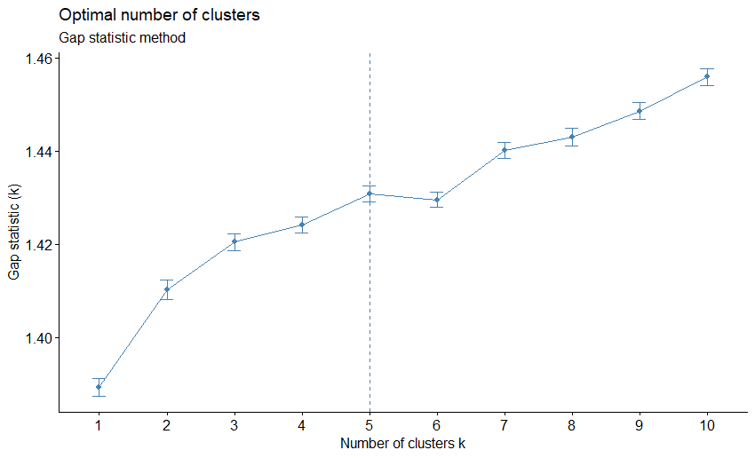
- As there there are more than 30 indices and methods to we can compute all them in order to decide the best number of clusters using the majority rule
9.4 Exploratory Factor Analysis
When running the EFA we get two important results
Variable’ factor loadings: Quantify the relationship (correlation) between each factor and each feature.
Observations’ factor scores: Estimates much of each factor each observation present.
9.4.1 Coding Example
- Loading libraries to use
library(ade4)
library(GPArotation)
library(psych)

data(olympic)
OlympicDt <- as.data.table(olympic$tab)

extract_fa_summary <- function(x){

  as.data.table(
    # The [] are really good trick
    # to transform object class from loadings to matrix
    x$loadings[],
    keep.rownames = "col_names"
  )[, `:=`(complexity = x$complexity,
           communalities = x$communalities,
           uniquenesses = x$uniquenesses)][]

}- Run the default EFA
FaDefault <- fa(
  OlympicDt,
  nfactors = 2,
  rotate = "none"
)

fa.diagram(FaDefault)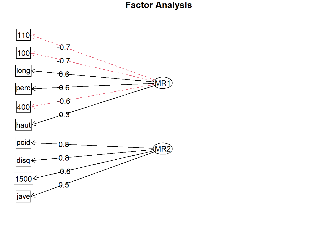
FaDefaultSummary <- extract_fa_summary(FaDefault)

FaDefaultSummary
col_names MR1 MR2 complexity communalities uniquenesses
1: 100 -0.7137105 0.25681201 1.254681 0.57533508 0.42466494
2: long 0.6487212 -0.25057510 1.291896 0.48362698 0.51637289
3: poid 0.5619076 0.79354373 1.801345 0.94545194 0.05454816
4: haut 0.3067493 0.01369787 1.003988 0.09428232 0.90571722
5: 400 -0.6265302 0.57944318 1.987915 0.72829430 0.27170557
6: 110 -0.7470264 0.14562740 1.075896 0.57925571 0.42074421
7: disq 0.3516307 0.75158223 1.417759 0.68851997 0.31148000
8: perc 0.6456073 0.16696264 1.133166 0.44468513 0.55531465
9: jave 0.3045271 0.46544681 1.723550 0.30937671 0.69062251
10: 1500 -0.2518295 0.58072631 1.363252 0.40066125 0.59933885As MR1 shows some negative correlations as for those exports higher values represent bad results.
library(ggplot2)

as.data.table(FaDefault$scores
)[, id := .I
][, melt(.SD, id.vars = "id", variable.factor = FALSE)] |>
ggplot(aes(value))+
  stat_ecdf(aes(color = variable))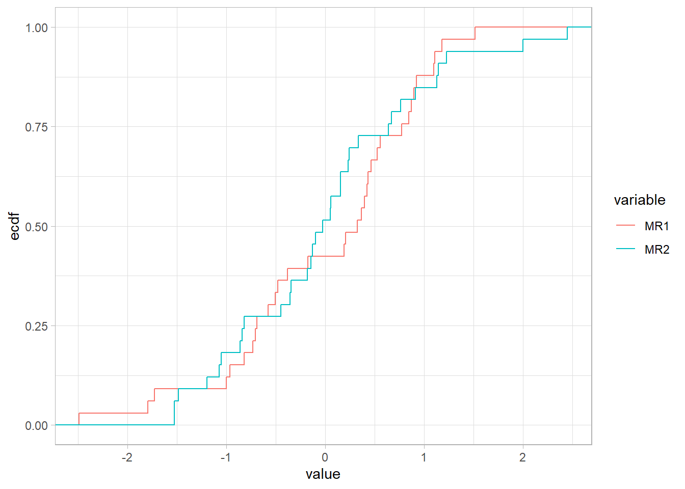
- Let’s change the sign in columns were the variable is measuring time.
NegCors <- FaDefaultSummary[MR1 < 0, col_names]

OlympicDtNeg <-
  copy(OlympicDt)[, (NegCors) := lapply(.SD, `-`),
                  .SDcols = NegCors]

FaNeg <- fa(
  OlympicDtNeg,
  nfactors = 2,
  rotate = "none"
)

fa.diagram(FaNeg)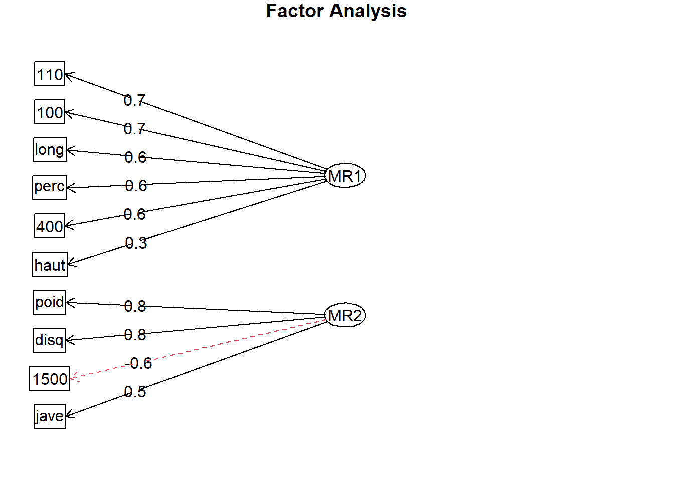
FaNegSummary <- extract_fa_summary(FaNeg)

FaNegSummary[order(-MR1)]
col_names MR1 MR2 complexity communalities uniquenesses
1: 110 0.7470264 -0.14562740 1.075896 0.57925571 0.42074421
2: 100 0.7137105 -0.25681201 1.254681 0.57533508 0.42466494
3: long 0.6487212 -0.25057510 1.291896 0.48362698 0.51637289
4: perc 0.6456073 0.16696264 1.133166 0.44468513 0.55531465
5: 400 0.6265302 -0.57944318 1.987915 0.72829430 0.27170557
6: poid 0.5619076 0.79354373 1.801345 0.94545194 0.05454816
7: disq 0.3516307 0.75158223 1.417759 0.68851997 0.31148000
8: haut 0.3067493 0.01369787 1.003988 0.09428232 0.90571722
9: jave 0.3045271 0.46544681 1.723550 0.30937671 0.69062251
10: 1500 0.2518295 -0.58072631 1.363252 0.40066125 0.59933885Now as all items have positive correlations we know that the first factor is measuring good physical condition.
FaNegSummary[order(-MR2)] col_names MR1 MR2 complexity communalities uniquenesses
1: poid 0.5619076 0.79354373 1.801345 0.94545194 0.05454816
2: disq 0.3516307 0.75158223 1.417759 0.68851997 0.31148000
3: jave 0.3045271 0.46544681 1.723550 0.30937671 0.69062251
4: perc 0.6456073 0.16696264 1.133166 0.44468513 0.55531465
5: haut 0.3067493 0.01369787 1.003988 0.09428232 0.90571722
6: 110 0.7470264 -0.14562740 1.075896 0.57925571 0.42074421
7: long 0.6487212 -0.25057510 1.291896 0.48362698 0.51637289
8: 100 0.7137105 -0.25681201 1.254681 0.57533508 0.42466494
9: 400 0.6265302 -0.57944318 1.987915 0.72829430 0.27170557
10: 1500 0.2518295 -0.58072631 1.363252 0.40066125 0.59933885After arranging the second factor we can see that we have positive correlations with exports that need strength and the negative items are more related to running.
- Rotate the factors to get a different interpretation.
FaRotated <- fa(
  OlympicDtNeg,
  nfactors = 2,
  rotate = "oblimin"
)

FaRotatedSummary <- extract_fa_summary(FaRotated)

FaRotatedSummary
col_names MR1 MR2 complexity communalities uniquenesses
1: 100 0.74363071 0.10728317 1.041609 0.57533508 0.42466494
2: long 0.68497344 0.08232462 1.028884 0.48362698 0.51637289
3: poid 0.05957999 0.96647757 1.007600 0.94545194 0.05454816
4: haut 0.25408053 0.15601402 1.660220 0.09428232 0.90571722
5: 400 0.83975679 -0.21939302 1.135878 0.72829430 0.27170557
6: 110 0.71329125 0.22139650 1.190909 0.57925571 0.42074421
7: disq -0.09739014 0.83067815 1.027486 0.68851997 0.31148000
8: perc 0.46180342 0.45071592 1.998820 0.44468513 0.55531465
9: jave 0.01360190 0.55512758 1.001201 0.30937671 0.69062251
10: 1500 0.52123292 -0.39628266 1.866531 0.40066125 0.59933885After checking the results we can have the next conclusions:
- First factor is correlated with running exports from
400tolongas they complexity is close to 1.
FaRotatedSummary[order(-MR1)] col_names MR1 MR2 complexity communalities uniquenesses
1: 400 0.83975679 -0.21939302 1.135878 0.72829430 0.27170557
2: 100 0.74363071 0.10728317 1.041609 0.57533508 0.42466494
3: 110 0.71329125 0.22139650 1.190909 0.57925571 0.42074421
4: long 0.68497344 0.08232462 1.028884 0.48362698 0.51637289
5: 1500 0.52123292 -0.39628266 1.866531 0.40066125 0.59933885
6: perc 0.46180342 0.45071592 1.998820 0.44468513 0.55531465
7: haut 0.25408053 0.15601402 1.660220 0.09428232 0.90571722
8: poid 0.05957999 0.96647757 1.007600 0.94545194 0.05454816
9: jave 0.01360190 0.55512758 1.001201 0.30937671 0.69062251
10: disq -0.09739014 0.83067815 1.027486 0.68851997 0.31148000- The second factor is related to strength exports from
poidtojave.
FaRotatedSummary[order(-MR2)] col_names MR1 MR2 complexity communalities uniquenesses
1: poid 0.05957999 0.96647757 1.007600 0.94545194 0.05454816
2: disq -0.09739014 0.83067815 1.027486 0.68851997 0.31148000
3: jave 0.01360190 0.55512758 1.001201 0.30937671 0.69062251
4: perc 0.46180342 0.45071592 1.998820 0.44468513 0.55531465
5: 110 0.71329125 0.22139650 1.190909 0.57925571 0.42074421
6: haut 0.25408053 0.15601402 1.660220 0.09428232 0.90571722
7: 100 0.74363071 0.10728317 1.041609 0.57533508 0.42466494
8: long 0.68497344 0.08232462 1.028884 0.48362698 0.51637289
9: 400 0.83975679 -0.21939302 1.135878 0.72829430 0.27170557
10: 1500 0.52123292 -0.39628266 1.866531 0.40066125 0.59933885- To be good at
percyou need to be good at running and have enough strength, having strength might makes harder to run1500and the current model doesn’t explainhaut.
FaRotatedSummary[order(-complexity)] col_names MR1 MR2 complexity communalities uniquenesses
1: perc 0.46180342 0.45071592 1.998820 0.44468513 0.55531465
2: 1500 0.52123292 -0.39628266 1.866531 0.40066125 0.59933885
3: haut 0.25408053 0.15601402 1.660220 0.09428232 0.90571722
4: 110 0.71329125 0.22139650 1.190909 0.57925571 0.42074421
5: 400 0.83975679 -0.21939302 1.135878 0.72829430 0.27170557
6: 100 0.74363071 0.10728317 1.041609 0.57533508 0.42466494
7: long 0.68497344 0.08232462 1.028884 0.48362698 0.51637289
8: disq -0.09739014 0.83067815 1.027486 0.68851997 0.31148000
9: poid 0.05957999 0.96647757 1.007600 0.94545194 0.05454816
10: jave 0.01360190 0.55512758 1.001201 0.30937671 0.69062251- Adding other factor.
FaRotated3 <- fa(
  OlympicDtNeg,
  nfactors = 3,
  rotate = "oblimin"
)

FaRotated3Summary <- extract_fa_summary(FaRotated3)

FaRotated3Summary[order(-MR3)]
col_names MR1 MR2 MR3 complexity communalities
1: 1500 0.003753265 -0.05992761 0.88990937 1.009105 0.82720135
2: long 0.450088329 0.18593744 0.37985963 2.307547 0.49280544
3: 400 0.623819228 -0.15638420 0.36089111 1.750136 0.68637827
4: jave -0.150141914 0.70682481 0.19604923 1.249068 0.41972639
5: 100 0.725029988 0.02808030 0.09573790 1.037913 0.58952541
6: haut 0.207138333 0.16086084 0.08540410 2.257498 0.09434134
7: perc 0.476748412 0.37584090 0.00799539 1.897303 0.44434936
8: poid 0.062219693 0.95307506 -0.03125526 1.010684 0.95312415
9: 110 0.906603876 0.01221335 -0.13377492 1.043896 0.76358834
10: disq 0.000360462 0.75003215 -0.16983917 1.102284 0.66191704
uniquenesses
1: 0.17279751
2: 0.50719138
3: 0.31361941
4: 0.58026537
5: 0.41047863
6: 0.90565800
7: 0.55564693
8: 0.04687213
9: 0.23641248
10: 0.33807947The new third factor is related to 1500, the long and 400 factors are now related to MR1 and MR3.
- Confirm your results by creatinga chart.
merge(x = FaRotatedSummary,
      y = FaRotated3Summary,
      by = "col_names",
      suffixes = c("_2F", "_3F")) |>
  ggplot(aes(MR1_2F, MR1_3F))+
  geom_blank(aes(MR1_2F*1.1, MR1_3F*1.1)) +
  geom_point(aes(size = MR3,
                 color = abs(MR2_2F - MR2_3F))) +
  geom_abline() +
  geom_text(aes(label = col_names),
            vjust = -1) +
  scale_x_continuous(labels = scales::percent_format(),
                     breaks = scales::breaks_width(0.2)) +
  scale_y_continuous(labels = scales::percent_format(),
                     breaks = scales::breaks_width(0.2)) +
  scale_size(labels = scales::percent_format())+
  scale_color_gradient(low = "blue",
                       high = "red") +
  labs(title = "Results After Adding\nThe Third Factor",
       x = "Original Factor 1",
       y = "New Factor 1",
       color = "Factor 2 Change",
       size = "Factor 3") +
  theme(plot.title = element_text(hjust = 0.5,
                                  face = "bold",
                                  size = 16),
        legend.position = "top")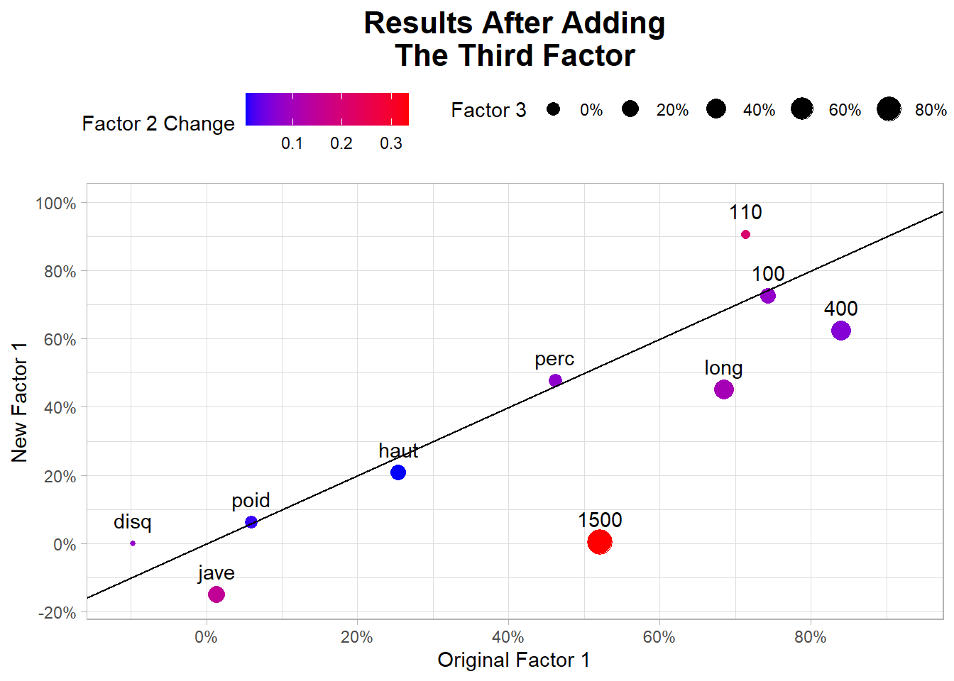
9.4.2 Finding clusters patterns
Para find cluster’s patterns we have 3 alternatives:
Using summary statistics by feature to compare groups with groups or one cluster the rest of the data.
Using PCA components to visualize clusters.
Plotting 2 dimensional plots each time with some dinamyc color or alpha.